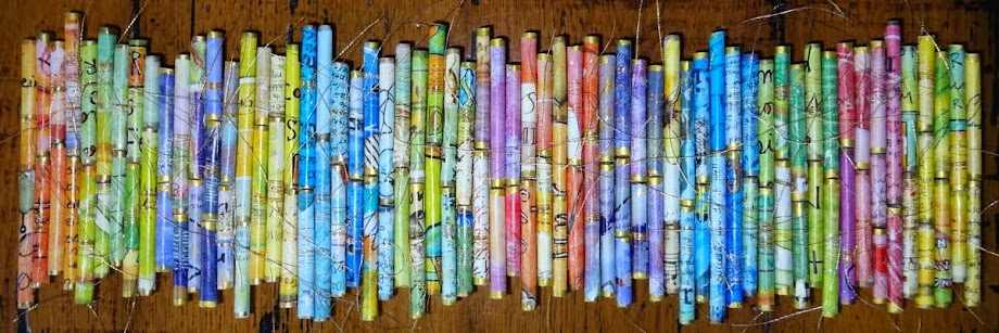
In 2011 Ellen, Lynn and I wanted to start a shared art project. We decided to exchange a set of alphabet ATC's. (artist trading cards...2 1/2 by 3 1/2 inches) We would make one of each letter and exchange them over a year ending up with a whole set that was a mixture of all of our work. We mapped out the calendar and got to work. We were to mail a few cards each month in order to inspire each other and watch our own new set grow.
This is the set I made. Some of them are in my complete set and the others are divided between Ellen and Lynn.
A is for altered.....an altered Pokemon card left over from one of my kids.
B is for blue. I used blue buttons and beads, and a little bling. Do you recognize the bottles from the
instant art post? Martha's bottles just keep on giving.
 C
is for color. I started with an image of colored pencils from a greeting card and had fun embellishing.


D is for dew drop. This photograph was taken in Door County, WI where the project was planned. There was a feather covered in drops on the beach in the middle of a sunny day and it sparkled in the sun. The card also features a dotted "D" and a little dangle.
The photo doesn't show but some of the dewdrops and part of the image. are dimensional.
E is for energy....energy from the sun. I edged the card in awesome "E" words.
 F
is for farm. I had fun with this one. It includes a funky frame with fabric fields of french knots and a little fence.
 G
is for glitter, glisten, glitz, glow, gleam, glamour and glimmer. Did you notice the glitter "g?"
H is for happy. That's it...just happy. Oh yes, there is a heart.
 I
is for indigo inchie. It includes a picture of an indigo bunting.
J is for joy.....jumping for joy to be exact.
K is for kaleidoscope. I made the little images using a program I bought a while back called "KaleidoPix." You can upload a picture and manipulate it into a kaleidoscope image.
L is for laughter...featuring lavender and lace.
 M
is for mosaic.

N is for nature. I did it in neutral tones and included narcissus. a nest, and bits of an actual nautical map. And, I snipped the date and the larger letters from the newspaper.
 O
is for outrageous. It features the color orange and orbs and ovals.
P is for pink and purple polka dots and patterns. This is one of my favorite quotes.
This one is actually a pop up card.

When you open it the word "play" pops up!
"It's a happy talent to know
how to play."
Ralph Waldo Emerson.
Q is for quilt. The tiny log cabin quilt block is made from hand-dyed fabrics I bought at a quilt show.
R is for rainbow....and ric rac, and ribbon....oh yes...they are all in a row.
 S
is for stones, seagull, sand dollar, seed beads, sunset, starfish, a stack of stones, sea glass and sequence. Some of the photos were taken on the beach in South Carolina and there is stitching on the outside edge.
T is for a tangled tree. (as in Zentangled)
 U
is for umbrella....and under....
 V
is for village.
After all...it does take a village! The little houses were made from watercolor and collage scraps.
 W
is for wool, weaving, and wisdom. The W is cut out of a watercolor scrap. The photographs of the wool were taken at a rug hooking store in Maine.
X is for X-stitch and excellence and extraordinary.
The background is made from the "KaleidoPix" program mentioned above.
Y is for yippee, yellow and yarn.
 Z
is for Zentangle!
Lynn's set
MaryAnn's set
Ellen's set
Thanks Ellen and Lynn! This was a fun project!