It's always fun when a cyanotype print comes out better than expected. I made this sun print from three layers of one of the the ferns by my front door.

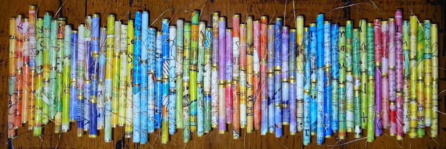
When I went to trim up the prints for the cards I just delivered to the farm stand a few days ago...the cutoffs from the previous set were still on my cutting table. (I'm not very good a picking up after myself in the studio.) They were too pretty to throw away with all their pretty shades of blue and gold watercolor speckles....so I turned them into a tag.

The back was an experiment where I blotted up the chemical solution onto rice paper. Once it was dry I put it in the sun and let the blotches process! No plants or stencils needed.

The flow on the backs of the last two cards is better than expected too....which was pretty easy when working with just blues. But I am going to be more tuned into that going forward.


That fern print is spectacular, MaryAnn. Really outstanding, which is no small accomplishment given how beautiful ALL your prints are. And I just love your tags—they're like elegant rosary beads or something of that kin; I can imagine myself just going through them one by one by one, and then starting all over again.
ReplyDeleteThanks Dotty....they are kind of like rosary beads. I have flipped through my last set again and again! They become a great resource for simple little art projects!
DeleteLoving this tag project. I did the Full Deck Challenge in 2025 using shipping tags but I like that your tags are smaller. The color shift from one to the next is wonderful (I didn't do that at all, mine were all over the color map). I like working small, too - less is needed, scraps and bits are put to use, and there isn't such a huge investment of time for each one.
ReplyDeleteThanks Julie...I'm loving it too and it's helping me ease my way back into art. The size is perfect...and if you don't like one...the next one comes right along. The color shift gives it just a bit of thoughtful challenge....and I highly recommend it.
Delete