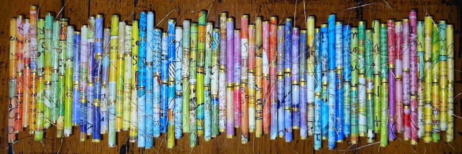
It occurred to me that my pile of prints look a lot like my paper tubes at the top of the blog.....I guess that's my colorful comfort zone.
I took some photos of the steps in making mono prints with a gel plate today. It's hard to take pictures while your'e printing....you have to work pretty fast because these thin layers of paint dry quickly. And it's messy.
 I started with an atlas index page....I found this paper takes the paint really well. I added several drops of paint to my gel press...I wanted a light green.
I laid my paper down and applied pressure over the whole plate....and I pulled up a corner to see what it looked like.

 Then I just pulled it off. It ended up being kind of neon....but it can be toned down. I don't always get the colors and color combos right...and I only have so many colors to work with. I'm new to acrylic paints...especially mixing them.
For the next layer I used this crazy floral stencil and this time I used a darker green.

I dropped on the paint, rolled out, and placed the stencil on top.


This time I pressed with my hand and used my fingers to work the paper in around the stencil.


I was able to pick up the corner to gave it a little check. It's quite a sharp contrast...maybe too much...but the print came out came out pretty good. I'll do another layer to tone down that neon green.


 What's left on the plate under the stencil is a ghost print and you can usually pull it right off with another piece of paper. I chose this junk print just to see what would happen.
It's always interesting to pull the paper off to see what you get....you never know. It's not that bad...especially on the teal end.
 There was still some of the ghost print left on the plate and I was able to pull that up with fresh paint...I chose a bright yellow. The ghost print is dry at this point...but the fresh paint somehow releases it. (most of the time)
 I rolled out the paint over the ghost print and this time chose a map page from the atlas wondering what results I would get.
 I liked the looks of it when I started pulling. I'm amazed how this atlas paper pulls all the paint so well. The pinky peach parts of the map became an interesting orange and I got all kinds of greens from the other parts of the map. I kind of like it! It's full of texture.
I tried to tone down the first on with a third layer of dark blue....same process this time using a circle stencil.

The print came out OK...but I still think it's stark and too much of a contrast. I'm not quite sure at this point how to tone it down. Maybe I'll consult with Elizabeth to get her suggestions. I might be able to do a light paint wash over the whole thing.
I pulled the ghost print rolling a lighter blue on top and really like this one. Layer upon layer upon layer....that's what I've been doing.


No comments:
Post a Comment